
Mathematics, 01.09.2020 20:01 mathnation1
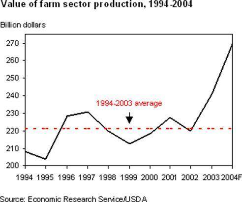
The following graph shows farm sector production in billions of dollars from 1994–2003. One line shows the yearly production and the other shows the average over the time span. According to the graph, in which 3 years were the values of farm sector production closest to the average for the 10 years shown?
A): 1994, 1996, 1998
B): 1996, 1998, 2000
C): 1998, 2000, 2002
D): 2000, 2002, 2004

Answers: 2


Another question on Mathematics
Mathematics, 21.06.2019 14:30
An eight-sided die, which may or may not be a fair die, has four colors on it; you have been tossing the die for an hour and have recorded the color rolled for each toss. what is the probability you will roll a brown on your next toss of the die? express your answer as a simplified fraction or a decimal rounded to four decimal places.
Answers: 2
Mathematics, 21.06.2019 15:10
Aboat's value over time is given as the function f(x) and graphed below. use a(x) = 400(b)x + 0 as the parent function. which graph shows the boat's value increasing at a rate of 25% per year?
Answers: 3
Mathematics, 21.06.2019 16:20
7.(03.01 lc)which set represents the range of the function shown? {(-1, 5), (2,8), (5, 3), 13, -4)} (5 points){-1, 2, 5, 13){(5, -1), (8, 2), (3,5), (-4, 13)){-4, 3, 5, 8}{-4, -1, 2, 3, 5, 5, 8, 13}
Answers: 3
You know the right answer?
The following graph shows farm sector production in billions of dollars from 1994–2003. One line sho...
Questions


Biology, 11.11.2021 03:50

SAT, 11.11.2021 03:50

Business, 11.11.2021 03:50
Mathematics, 11.11.2021 03:50

Medicine, 11.11.2021 03:50

Chemistry, 11.11.2021 03:50

Mathematics, 11.11.2021 04:00
Mathematics, 11.11.2021 04:00
Chemistry, 11.11.2021 04:00

History, 11.11.2021 04:00
Health, 11.11.2021 04:00


